Neon or Brass? Two Visual Languages for a Casino Poster
Compare neon and brass casino poster design to choose colours, type, and materials that signal distinct moods without making claims about a venue.
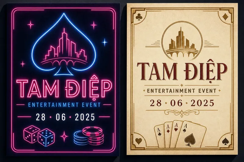
Which should a casino poster use: neon for a lively, contemporary mood or brass tones for a more composed, classic one? Neon and brass casino poster design starts with that choice, but the decision is not simply bright versus muted. Colour, lettering, texture, and spacing work together to suggest a visual character; none of them proves what a venue is like.
What does neon communicate on a casino poster?
Neon-led design suggests energy through saturated colour, sharp contrast, and a sense of light against darkness. Electric blue, magenta, or acid green can make a headline feel immediate, while a dark navy or charcoal field gives those hues room to stand out.
The visual cue comes partly from familiar associations with illuminated signs and nighttime streets. A drawn glow or a bright outline can evoke that look on paper or on a screen, even when the poster itself is not made from illuminated material.
Neon does not have to mean a crowded composition. One luminous word, a simple geometric border, and plenty of dark negative space can feel more deliberate than a page filled with gradients and glowing symbols. Restraint helps the chosen colour read as a design decision rather than visual noise.
What does brass suggest in a casino poster?
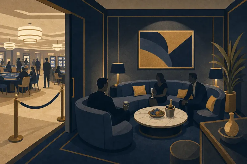
Brass-toned design leans toward warmth, formality, and material richness. Muted gold, bronze, cream, and deep burgundy can suggest polished metal, engraved lettering, or the finish of a decorative object without claiming that those materials appear inside a venue.
The impression depends on how the colour is handled. A flat ochre block may feel graphic and contemporary; a fine grain, restrained highlight, or hairline border can hint at a brushed or embossed surface. Too many shiny effects, however, can make the page look like imitation foil rather than a considered composition.
Brass also works well with open spacing and carefully aligned type. A serif headline may reinforce a traditional tone, but it is not a requirement: a clean sans serif can make warm metallic colours feel current and spare.
How do neon and brass differ in mood?
Neon tends to create a feeling of immediacy: the eye meets a bright accent quickly, then moves through the darker field. Brass tones usually feel quieter and more collected, inviting attention to typography, borders, and surface detail. These are design tendencies, not fixed meanings.
Neither palette is inherently more welcoming, luxurious, exciting, or trustworthy. Those judgments depend on the full composition and on the viewer’s own associations. A neon palette can look elegant when tightly controlled, while brass can feel playful when paired with unusual lettering or a lively layout.
Think about the intended poster’s role before picking a side. A compact event notice that needs a clear, visible headline may benefit from a strong neon accent. A printed piece designed to reward a closer look may suit a brass-toned palette and finer details.
Which typography suits each poster style?
Neon designs often pair well with sturdy sans-serif lettering because simple forms stay legible against bright colour and simulated glow. A condensed display face can add a brisk, sign-like quality, while a neutral supporting typeface keeps dates and practical details easy to scan.
Brass-toned designs can use either serif or sans-serif type. A high-contrast serif may add a formal note, while a geometric sans serif can keep the treatment from feeling antique. What matters is the relationship between letter shape, weight, and the visual texture around it.
Give the main headline clear priority, then distinguish secondary information through size, weight, or spacing rather than through a pile of decorative fonts. Check punctuation, small text, and letter spacing at the intended viewing size; a beautiful display face cannot compensate for details that become hard to read.
How should colour and texture work together?
Colour establishes the main contrast; texture gives that contrast a surface. In a neon design, a smooth dark field can make a luminous edge feel crisp, while a subtle grain may soften the effect. In a brass treatment, a restrained paper texture or fine linework can create depth without pretending to be a photograph of metal.
Choose one dominant surface idea and let it support the message. Several competing effects—glow, bevel, metallic shine, and heavy grain—can obscure the type and flatten the hierarchy. A convincing material cue is usually selective: a small highlight or a delicate engraved-style line can do more than a full-page imitation of a surface.
Colour relationships matter as much as individual swatches. Pairing neon magenta with deep blue creates a different impression from pairing it with black; brass and cream feel different from brass and burgundy. Make the contrast purposeful, and preserve enough separation between text and background for the information to remain clear.
How can you choose between the two styles?
Start with the feeling the poster should invite, then ask what the audience needs to notice first. If the emphasis is a vivid, contemporary event identity, a small number of electric accents may fit. If the goal is a composed, decorative look, warm metallic hues and measured detailing may be a better match.
Say you are designing an invented poster for a Tam Điệp entertainment event, with a short headline and a date that must be easy to spot. You could set the headline in warm white on a charcoal field, use a single magenta outline as the visual accent, and place the date in a clear sans serif below it. The expected result is a page with one immediate focal point and supporting information that remains distinct; it would communicate a design mood, not establish anything about the actual event or venue.
For a brass direction, the same invented event could use a cream background, a restrained bronze border, and a dark burgundy headline. The expected result would be a quieter, more formal impression, with the border and colour carrying the material suggestion rather than a claim that real brass is present.
It is not worth adding glow to every letter or metallic effects to every border. If an effect does not clarify hierarchy or strengthen the intended mood, remove it and let the typography and palette do the work.
What should you consider before printing or sharing the poster?
Screen colour and printed colour can differ, and small details may behave differently on a phone, a flyer, or a large display. Review the design in the format where people are most likely to see it. If it will be printed, a proof can help reveal whether a dark field swallows fine type or whether a warm metallic colour loses its contrast.
Keep the practical information readable regardless of palette. Dates, locations, and any conditions should not depend on a faint glow, a delicate foil-like line, or a colour distinction that may be difficult to perceive. For production choices, follow the printer’s specifications and the requirements of the intended platform.
For a digital poster, avoid relying on simulated shine as the only cue that something is important. A clear type hierarchy and a distinct contrast between headline and background remain useful even when a device displays colours differently.
Which poster style should you choose?
Choose neon when a concentrated burst of colour and a nighttime sign-like character suit the design brief. Choose brass when warmth, fine detail, and a more measured visual rhythm fit better. If both moods seem relevant, combine them sparingly: for example, a brass-toned headline with one neon accent can create contrast without letting either language take over.
Can a poster style tell me what a venue is like?
No. A poster is a designed message, not evidence of a venue’s actual appearance or atmosphere. Neon graphics may suggest an energetic mood, and brass tones may suggest a formal one, but neither establishes what a visitor would encounter.
Does neon have to look loud?
No. A single luminous colour on a dark, uncluttered field can feel controlled and refined. Limiting the glow and leaving open space often makes neon accents easier to read.
Can brass tones look contemporary?
Yes. Pair warm metallic colours with simple shapes, clean sans-serif type, or generous spacing to avoid relying on old-fashioned ornament. The palette can remain tactile while the composition feels current.
Which style is easier to read?
Neither palette is automatically more legible. Readability depends on contrast, type size, letter spacing, and the amount of detail behind the text, so review the actual composition rather than judging the colour names alone.
For neon and brass casino poster design, the useful question is not which palette makes the stronger promise; it is which one helps the intended message feel coherent and readable. Treat colour and material cues as expressive choices, then let the finished poster describe its own mood without standing in for the venue.